WashU
The Graduate Center
Brand Alignment • Visual Identity Refinement • Messaging Framework • Character Illustration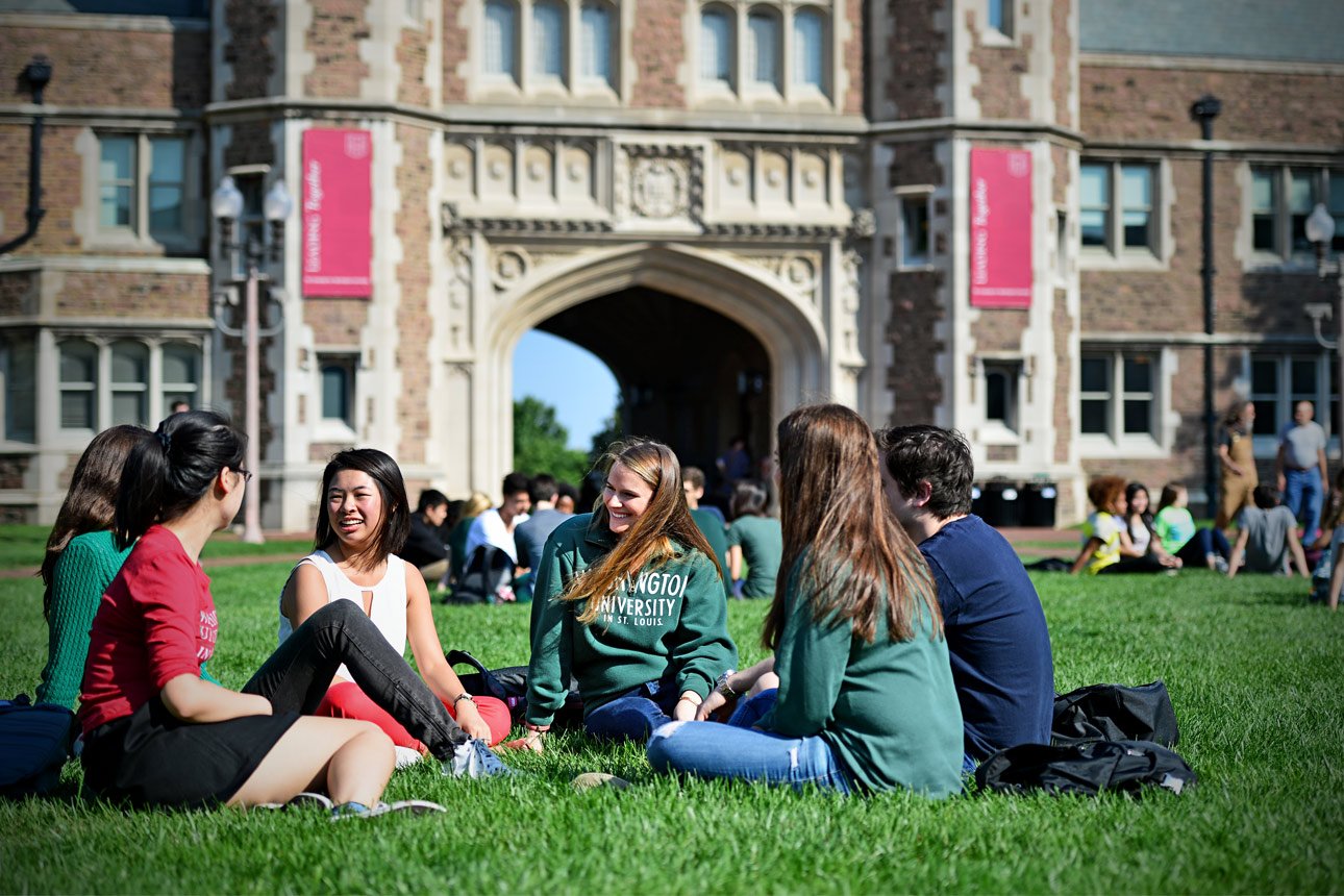
The Transformation
A previously inconsistent collection of materials, messaging, and visual standards was unified into a single brand system. That system now carries across print, digital, programming, and physical spaces.
The result is not just alignment. It’s clarity at scale.
1
Unified System
Dozens of fragmented brand assets transformed into a single unified system.
1
Recognizable Presence
Multiple identities and communications were consolidated into a single, recognizable presence.
1
Cohesive Voice
Inconsistent messaging was clarified into one cohesive voice across all touchpoints.

Clarity doesn’t just improve how a brand looks. It changes how it performs.
If you see yourself in these transformations, the next step is clarity.
Clarity Within Complexity
* The Context
Washington University in St. Louis was undergoing a broader institutional shift toward the “WashU” brand identity.
Within that transition, the Graduate Center faced a common challenge: multiple materials, logos, and communications had developed over time without a cohesive system.
The result was a patchwork of visual standards and messaging that made it difficult for graduate and professional students to clearly recognize the center’s role within the university.
* The Strategy
The goal was not to reinvent the brand but to bring clarity and alignment.
The Graduate Center needed a visual language and messaging structure that honored the broader WashU identity while allowing the center to stand out within a large and complex campus ecosystem.
The solution involved both strategic alignment and creative differentiation.
* What We Built
Sophisticated Mouse developed a comprehensive brand guide and supporting creative system.
This included:
• Graduate Center brand guidelines aligned with WashU
• visual identity refinement
• messaging framework and communication standards
• collateral design systems
• character illustration development
Two bear mascots — Tamington and Cap — were created to help the center communicate with warmth and personality while remaining visually recognizable within university materials.
* The Shift
The Graduate Center now has a cohesive brand system that aligns with the university while maintaining its own identity.
Communications across materials, programming, and physical spaces now feel intentional and unified.
Students can more easily recognize the Graduate Center as a hub for resources, programming, and community.
* The Outcome
The refreshed brand created a stronger sense of identity and belonging for graduate and professional students.
Programs and communications now operate within a cohesive visual and messaging framework that supports the center’s long-term growth and visibility on campus.